Wednesday, November 27, 2013

Does Being Ethical Pay?


Does Being Ethical Pay?

As this article explains, "for corporations, social responsibility has become a big business." In other words, corporations believe that consumers are willing to pay a premium price for ethically produced products. The authors of this article created three experiments to put this idea to the test.

In the first experiment they gave the three groups different information regarding the production standards of a coffee company, one group got positive information, one group received negative information and the last group (control group), received no information. The groups were then asked to write down the price they would be willing to spend on a pound of this coffee. The ethical group’s mean price was substantially higher than the control group and the unethical group, (See exhibit one). The second experiment was designed to test the sensitivity between the price the consumer is willing to pay and the degree of ethical standards, e.g. whether a 100% organic cotton shirt would be worth more than a 75%, or a 50%, and so on. The results prove to be insignificant, (See exhibit two). In the last experiment the authors place the subjects into two groups, one with high-expectations and one with low-expectations; they do not explain how they go about this. They found that the group with high-expectations was more price sensitive when it came to ethics than the group with low-expectations, (See exhibit three). In the end they come to the conclusion that companies should target ethically minded consumers with ethically marketed products because their willingness to pay is greater than an average consumer.

It surprises me however, that they don’t explore the issue that in all these experiments the groups were given specific information about the ethical or unethical production standards of the company they were surveyed about, whereas most consumers outside of the experiment are not informed about production standards. If you are to go with the conclusion in this article then surely your next step would be to start an elaborate marketing campaign to generate high-awareness of the ethical production of your product; a cost not mentioned in this analysis. The other issue I have with these experiments is we’re never informed who they surveyed. The way an experiment is designed and the sample of people used have a great effect on the outcome. If everyone sampled was from a university in the northwest versus a small town in Arkansas, the results are going to vary greatly. All-in-all a very interesting article that carries with it significant implications that could affect how industry operates for generations to come.


Uber Warehouses for the Ultra Rich

Über-warehouses for the ultra-rich
"Tell Jeeves to pull the jet around, I have some art to drop off in Luxembourg." If you are anything like me these words are not uttered frequently in your house but for ultra-high net worth individuals warehousing in "tax friendly" countries is becoming increasingly popular. Maybe after completing our UW MBA program we will be able to join the ranks of the ultra-rich, now estimated at 199,235 individuals with assets over 30 million dollars. Individuals like this are the target of the new Freeport model. Staged at traditional airports, these uber warehouses offer attractions similar to banking attractions to offshore financial institutions. Low levels of scrutiny, the ability of owners to hide behind nominees, and an array of tax advantages.
 Because of the confidentiality, no one knows what the heck the value of goods stashed in freeports actually is. Currently it is thought to be in the hundreds of billions of dollars, and always increasing. A lot of what lies in these super secure airport warehouses is perfectly legitimate, but the protection offered from scrutiny ensures that they appeal to tax-dodgers. Freeports have been among the beneficiaries of the undeclared money, precious metals and valuable property flowing out of the US and Europe. Most of the data and graphs in the article serve to substantiate the claim that the reason the wealthy put their money into gold, art, and other collectibles is that it has been a better investment over the last 25 years.
Prices for vintage wine, fine art, rare stamps, precious coins and even classic guitars and violins have outpaced the market. The Economist has compiled recognized indices for each of these assets to create a valuables index. They have weighted each asset in the index according to rich individuals’ holdings, as reported by the wealth-management arm of Barclays: 36% fine art, 25% classic cars, 17% coins, 10% wine and 6% stamps. In this blended index the return has been over 210%. This has created new investment funds based on Guitars, stamps, classic cars and more.
I thought this was an article about how wealthy people spend money and shelter it but what it really taught me was about the new options in collectible funds. With a Beta of nearly 2 on average these collectible items, if valuable and rare creates a new and interesting opportunity for investing. The average person cannot afford to purchase a Van Gough or a classic Les Paul Guitar but they could buy into shares of collectible funds.

Older people sign up for coverage, but program needs the ‘young invincibles’

Affordable health care act is a hot topic in the country either for political or technological reasons.  As a result, we find many articles and blogs in almost every publishing medium expressing myriad of opinions on the same. In order to give credibility to their articles, many of these authors have thrown in data, graphs and any statistic they could lay their hands on without understanding relevance of the data to their articles and if the data supports the theory presented in their articles.
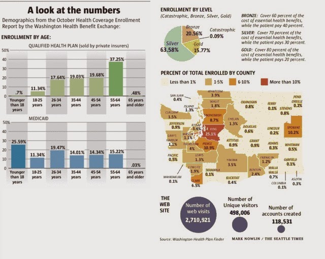
The article I am discussing today was on the coverage page of Seattle times dated 16th Nov 2013 1 and is about age demographics that is signing up for healthcare on Washington health exchange. This article stirred my interest as it was not only on a hot topic but also was very colorful with multiple charts, maps and data points.  Being a keen student of statistics, I set out on a mission to read, understand and analyze the data.
The author started the article with a conclusion that younger people are not signing up for health care and majority of the new signees are older people. He analyzed the numbers on Washington state health exchange website and provided the following graphs to justify his statement. He further went on to explain the story of a 27 year old young man who signed up for health care and his reasons for the same.

After reading the article and looking at the charts, I found that data was not corroborating the conclusion. The author’s statement that younger people are not signing up for coverage is not correct. Younger people may have not signed up for health plans sold by private insurers (Based on the bar charts, even that number is around 30% which is not small) as they have for Medicaid. In fact, majority of the people that signed up for Medicaid are young (around 57%).  Also, these graphs are based on the data for the month of October and size of the samples is completely different. The chart for private insurance is based on a sample of 6351 signees and the chart for Medicaid is based on a sample of 51,379 signees. If we combine data from these two sources, assume that 0-34 years age group is young population and 55 and above is older population, we find that for every older person that has signed up for insurance, three younger people have signed up ( ~ 10,000 older people to 31,200 younger people). Also the author did a basic rounding error where the sum of all percentages in the first chart is not equal to hundred. When you compare the total signees in this article with the total population of Washington State (6,897,012 2), the numbers and charts seem even more suspect.
The author also sprinkled in  details about various plans and percentage of people that signed up for these plans, number of signups by county, total number of web visits, percentage of women who signed up for these plans, etc.  
·         The data about various plans and percentage of people that signed up is great, but it is not relevant to the article or its conclusion.
·         The data about number of visitors to website does not contain age groups of the visitors to help us analyze the age demographics.
·         The map indicates the King county had the most new signups followed by Pierce and Snohomish counties. Even though this data is not relevant to the article, I did a quick correlation analysis on the population in these counties 3 against the number of new signups and found a strong correlation (0.97) among them with Spokane county being an outlier. Hence, the number of new signups is directly proportional to the population the county.

County
Population(In 1000s)
Signups (In %)
King
1,950
25.1
Pierce
795
10.9
Snohomish
713
8.7
Spokane
471
10.2
Clark
425
6.5

Population
Signups
Population
1

Signups
0.975942
1

In conclusion, the article has colorful charts and good data points. But, statistically it is inaccurate and presents a wrong picture of the healthcare signups.


Tech Is Hiring More Women Than Men For The First Time In 10 Years

In a surprising shift from the norm, women are now the most popular tech hires.The tech industry added 39,900 jobs between January and September, and 60% of those positions went to women, according to data from the Bureau of Labor Statistics. In every other year of the past decade, men claimed a greater share of new tech jobs, according to an analysis conducted by technology and engineering career hub Dice. 
- from businessinsider.com article

An industry colleague sent me this article because of my personal experience working in the technology (tech) sector and my active involvement with the Vancouver and Seattle chapters of Women in Games. He thought it would encourage me as I continue to interview with several different tech companies. He would have been completely correct if I had read this article before taking our statistics class. Now, I am forced to examine the numbers more closely in business articles I read, like a film school graduate who finds small movie flaws that no one else notices.

The article continues to say that this is a small but promising sign for women in tech, who have been holding steadily only about 31% of industry jobs over the past 10 years. However, the biggest disappointment to me was that women also continue to earn less than men. For example, a woman working full time in a computer and information system role makes only about 80 cents for every dollar earned by a man.

This latest shift cannot be explained clearly. A possible factor was the ‘new wave of female tech stars’, with Yahoo CEO and ex-Googler Marissa Mayer, Facebook COO Sheryl Sandberg, and IBM CEO Ginni Rometty cited as examples. Mayer has her masters in Computer Science, while Rometty has a degree in computer science and engineering; Sandberg studied Economics and has an MBA from Harvard. So this led me to question what was considered a tech job? I do not have a computer science or engineering degree, yet I consider myself to have worked in the tech industry for the past 6 years. As a side note, the Wall Street Journal article 'Elite Grads Flock to Tech’, discussed the increasing numbers of MBA grads choosing tech over finance jobs, which again led me to question how tech jobs were defined: where do finance roles at tech companies fall in this study?


 - chart from the Wall Street Journal


In examining the chart below, which shows the change in tech jobs by gender for the past decade, the first thing I realized is that the 2013 figure is not for a full year, with data only til September.  Since there is still a whole quarter left for the year, isn’t it conceivable that the number of men hired could still surpass women hired this year?

 - chart from businessinsider.com


The second thing I noticed was that while more men than women were hired from 2004 to 2008, there were more women who were laid off in 2009! This is probably due to the ‘last in, first out’ effect of layoffs, but I still would have thought the gender split would have been proportional in this job loss year. However, what positions did the women originally hold in the company?

The last thing I noticed in the graphic is that although, proportionally, more women than men have been hired so far in 2013, the actual numbers as a whole are down. Actual numbers of women hired in 2006 and 2007 are higher. However, I understand a bit better how we can spin statistics to support positivity.

In summary, I WAS still encouraged by the optimistic nature of this article but would be very careful about reporting the findings at a tech conference!

------------------------------------------------------------------------------------------
Articles:

References:

Do you know that you are risking your life when you go to the doctor?


The simple fact is that medical errors are within the top ten leading causes of death in the U.S. That said, consistent data is virtually impossible to gather.  The Institute of Medicine (IOM) estimates that as many as 98,000 die annually due to medical error at a cost of $29 billion.   OIM also estimates that 15 million incidents of medical harm occur annually.  An article in the Journal of Patient Safety extrapolated the results of four different studies to determine that between 210,000 and 440,000 patients who go to the hospital experience some level of preventable harm that contributes to their death.  In just a few sentences I am able to demonstrate that the variation in the estimates of medical harm make any kind of concrete analysis nearly impossible.  The estimates also suggest that the number of medical errors is astronomical.
 
Now consider the airline industry.  The airline industry is heavily regulated and monitored and concrete data is collected to include the fact that between the years of 2008 and 2012, 4,724 people were killed in plane crashes.  This is approximately 945 deaths per year.  Compare this concrete data to the nebulous estimates related to healthcare harm or death.  The airline industry data compared to the lowest estimates for health care (98,000) shows that plane crashes account for 0.1% of avoidable deaths comparative to healthcare errors.  How is it acceptable to have this kind of devastating error rate with an American public that remains virtually unaware of and/or blissfully ambivalent to the magnitude of the problem?  Why is there little to no media coverage when a healthy child dies during a routine tonsillectomy because the anesthesiologist mistakenly injected epinephrine in to the direct line; thereby irreparably damaging the child’s heart?  This is just one true story among thousands of examples that happen daily.  And yet if a single plane goes down and 150 people die it is a national news event for days or even weeks with coverage of every gruesome detail. 

Obviously, part of the problem is that concrete data is very hard to gather within the healthcare field since it is across a multitude of health systems; both private and public.  There is no regulation or requirement to nationally report on error rates and no standard level of accountability has been established within the healthcare system.  The very definitions of ‘medical error’ and ‘medical harm’ are nebulous and each health care entity can set its own standards.  Most relevant, is the fact that most of the information is based on estimates which can almost seem sensational instead of fact-based.  It is impossible to have a count that captures all of the times when patients experience preventable medical harm.  This leaves us with approximations which are imperfect at best.   

One area that is compelling and receives a lot of attention within many professional articles involves diagnostic errors.  This also was the topic of the article that inspired my blog post.  Diagnostic errors include those in which the patient is misdiagnosed, not diagnosed properly, or not diagnosed in a timely fashion.  Johns Hopkins researchers report that diagnostic errors account for most claims, most patient harm and the highest payouts.   In 2013 a study was done on 190 primary care physicians related to diagnostic error (exhibit 1).  In 2010 the number of primary care physicians was 209,000.  This means the sample size of 190 isn’t even 1% of the total number of primary care physicians which means the statistical relevance of the data is nil.  The data was provided to demonstrate some common diagnostic errors that are missed, why they are missed, and the harm that is caused.  However, with such a small sample size the results are meaningless other than as a starting point for a larger study.  The data provided has inconsistency including one total that adds up to 180%.  In fact, none of the percentages provided add up to 100% and no explanation was given as to how the percentages were figured.  It is of interest that the most significant numbers for ‘what they miss’ are all around 6%; this would indicate that the percentages are very small across a broad range of diagnosis codes.  It is unclear why these diagnoses were chosen over others.  There are also a multitude of unanswered questions that impact the results of this type of study.  How many visits did the patients have and over what time period?  What was the state of the patient panel in relation to health; was there a high or low volume of acute or chronic conditions?  What were the patient demographics?  These are just a few of the questions related to the human details and factors that would affect results. 

The article that spurred my topic selection, as well as all of the supporting articles I referenced, make it painfully clear that there is a serious problem collecting data.  The irony is that the medical profession is one of the most data-oriented and evidence-based professions.  Being able to measure the incidence of diagnostic error is essential if we really want the healthcare system to change.  Until we are able to measure error and create standard metrics that are enforced across all systems we will continue to see an incredible amount of unnecessary and avoidable medical harm.  Taking this one step further; eliminating medical error would radically reduce the cost of medical care within our country.  However, as demonstrated there is no good data at this time.  Without data there is also no clear end in sight to the high cost of healthcare related to medical error.  So far, the best we have is a government program called Obama care for which the most prevalent outcomes include a filibuster and a failing website. 

My advice based on the data is that if you are a healthy person and want to stay alive and medically harm-free, avoid healthcare.  How ironic is that?


Exhibit 1 – data as presented in article:

What They Miss
The Fallout
 
Pneumonia
6.7%
Potential Severity of injury from delayed or missed diagnosis:
 
Congestive Heart Failure
5.7%
Immediate or inevitable death
14%
Acute Kidney Failure
5.3%
Serious permanent damage
19%
Cancer
5.3%
Very serious harm, danger or permanent damage
16%
Urinary Tract Infection
4.8%
Considerable harm or remediation or treatment
38%
 
 
Minor harm or remediation or treatment
10%
Very minor harm or little or no remediation
2%
 
 
Inconvenience
1%
Why They Miss
No harm
2%
Ordering Diagnostic Tests
57%
 
 
History-taking
56%
Examination
47%
Referrals
20%


References:
Original Article:
The Wall Street Journal, ‘The Biggest Mistake Doctors Make’, by Laura Landro, November 18, 2013
 American Association for Justice, ‘Preventable Medical Errors – The Sixth Biggest Killer in America’ http://www.justice.org/cps/rde/justice/hs.xsl/8677.htm
 U.S. Department of Health and Social Services, Agency for Healthcare Research and Quality http://www.ahrq.gov/research/findings/factsheets/primary/pcwork1/index.html
Wikipedia, Aviation Accidents & Incidents
http://en.wikipedia.org/wiki/Aviation_accidents_and_incidents
Shots Health News from NPR, ‘How Many Die From Medical Mistakes in U.S. Hospitals?, by Marshall Allen, ProPublica, September 20, 2013
http://www.npr.org/blogs/health/2013/09/20/224507654/how-many-die-from-medical-mistakes-in-u-s-hospitals