Affordable health care act is a hot topic in the country
either for political or technological reasons.
As a result, we find many articles and blogs in almost every publishing
medium expressing myriad of opinions on the same. In order to give credibility
to their articles, many of these authors have thrown in data, graphs and any
statistic they could lay their hands on without understanding relevance of the
data to their articles and if the data supports the theory presented in their
articles.
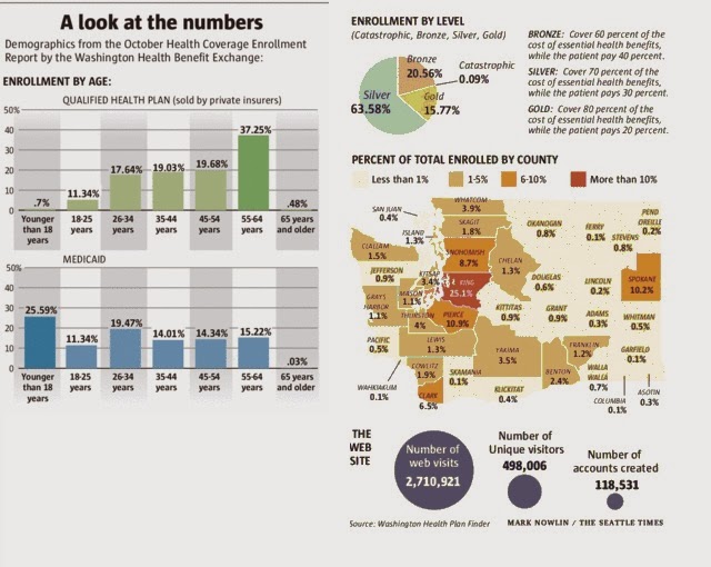
The article I am discussing today was on the coverage page
of Seattle times dated 16th Nov 2013 1 and is about age demographics
that is signing up for healthcare on Washington health exchange. This article
stirred my interest as it was not only on a hot topic but also was very
colorful with multiple charts, maps and data points. Being a keen student of statistics, I set out
on a mission to read, understand and analyze the data.
The author started the article with a conclusion that
younger people are not signing up for health care and majority of the new signees
are older people. He analyzed the numbers on Washington state health exchange website
and provided the following graphs to justify his statement. He further went on
to explain the story of a 27 year old young man who signed up for health care
and his reasons for the same.
 After reading the article and looking at the charts, I found
that data was not corroborating the conclusion. The author’s statement that
younger people are not signing up for coverage is not correct. Younger people may
have not signed up for health plans sold by private insurers (Based on the bar
charts, even that number is around 30% which is not small) as they have for
Medicaid. In fact, majority of the people that signed up for Medicaid are young
(around 57%). Also, these graphs are
based on the data for the month of October and size of the samples is
completely different. The chart for private insurance is based on a sample of
6351 signees and the chart for Medicaid is based on a sample of 51,379 signees.
If we combine data from these two sources, assume that 0-34 years age group is
young population and 55 and above is older population, we find that for every
older person that has signed up for insurance, three younger people have signed
up ( ~ 10,000 older people to 31,200 younger people). Also the author did a
basic rounding error where the sum of all percentages in the first chart is not
equal to hundred. When you compare the total signees in this article with the
total population of Washington State (6,897,012 2), the numbers and
charts seem even more suspect.
After reading the article and looking at the charts, I found
that data was not corroborating the conclusion. The author’s statement that
younger people are not signing up for coverage is not correct. Younger people may
have not signed up for health plans sold by private insurers (Based on the bar
charts, even that number is around 30% which is not small) as they have for
Medicaid. In fact, majority of the people that signed up for Medicaid are young
(around 57%). Also, these graphs are
based on the data for the month of October and size of the samples is
completely different. The chart for private insurance is based on a sample of
6351 signees and the chart for Medicaid is based on a sample of 51,379 signees.
If we combine data from these two sources, assume that 0-34 years age group is
young population and 55 and above is older population, we find that for every
older person that has signed up for insurance, three younger people have signed
up ( ~ 10,000 older people to 31,200 younger people). Also the author did a
basic rounding error where the sum of all percentages in the first chart is not
equal to hundred. When you compare the total signees in this article with the
total population of Washington State (6,897,012 2), the numbers and
charts seem even more suspect.
The author also sprinkled in details about various plans and percentage of
people that signed up for these plans, number of signups by county, total
number of web visits, percentage of women who signed up for these plans, etc.
·
The data about various plans and percentage of
people that signed up is great, but it is not relevant to the article or its
conclusion.
·
The data about number of visitors to website
does not contain age groups of the visitors to help us analyze the age demographics.
·
The map indicates the King county had the most new
signups followed by Pierce and Snohomish counties. Even though this data is not
relevant to the article, I did a quick correlation analysis on the population
in these counties 3 against the number of new signups and found a
strong correlation (0.97) among them with Spokane county being an outlier.
Hence, the number of new signups is directly proportional to the population the
county.
|
County
|
Population(In 1000s)
|
Signups (In %)
|
|
King
|
1,950
|
25.1
|
|
Pierce
|
795
|
10.9
|
|
Snohomish
|
713
|
8.7
|
|
Spokane
|
471
|
10.2
|
|
Clark
|
425
|
6.5
|
|
|
Population
|
Signups
|
|
Population
|
1
|
|
|
Signups
|
0.975942
|
1
|
In conclusion, the article has colorful charts and good data
points. But, statistically it is inaccurate and presents a wrong picture of the
healthcare signups.
No comments:
Post a Comment